
First Impressions
Just as my naivety left little room to imagine ballplayers other than the ones depicted on these 726 cards, the design of the 1980 Topps set was for me at the time simply the only way I knew baseball cards could look. If I'd thought about it, I probably would have assumed that if there were to be more baseball cards next season (wouldn't that be awesome!), they would probably look just about the same as these cards did. That makes an extra degree of mental gymnastics necessary for me when evaluating this set today. At the time I was pulling these out of packs, I really didn't have a benchmark for comparison. The design of the 1980 Topps set was simply the way baseball cards looked, as far as I knew. As such, I could find no fault.

33 Years Later...
There is some fault to find. But let's start with the basics. Player Name? A nearly universal given. Team Name? Check. Position(s)? Check. Good. What else do we have here? Well, here's something we don't have: a Topps logo. That was the norm in the 1970s (although they'd busted out the fish hook logo the previous year). But this would be the last time for a while, perhaps ever, that they didn't engage in some in-your-face branding. Of course, by 1981 they'd have good reason to let you know whose cards you were looking at. So that's one less thing to clutter up the front of these cards.
Unfortunately, they did choose to messy up the photos with facsimile autographs. Sorry, but I've never liked it when they do this. First of all, I'm not an autograph guy. Don't get me wrong, given an opportunity, I enjoy having a player sign his name for me. But it's more about having an interaction with a player and less about the resulting scribbling. I fail to see the potential for enjoyment in slapping a printed signature over a (hopefully) beautiful baseball card photo. Plus, if you actually have the opportunity to get a player to sign your card, you end up with a super-messy looking card with two signatures on it. No sir, I don't like it.
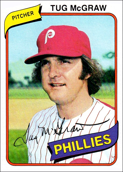
So how did they choose to frame the cards in this year's set? The name is bold, but simple, along the top of the card. The position gets a little flag to frame it in the upper left, with the team name getting a bigger flag over the top of the lower right corner. After a few years of collecting, I began to consider this design a bit boring and a little cluttered. But looking at it again now, I think the "boring" part was simply a function of having stared at them for so long, being the first and omnipresent set in every incarnation of my collection. It's actually a reasonably nice design. The flags (or ribbons? certainly not pennants) don't take much away from the photos, yet with their curves and slanted angle they're not as utilitarian as, say, the simple bar at the bottom of the previous year's set.
As for the use of color, the 1980 set really has more in common with what Topps had established in the 70s than where things were going in the 80s. You get a somewhat random mix of bright colors, with each team receiving a unified theme. Sometimes it coordinates with the team's uniform colors, and sometimes it does no such thing. The Rangers look good. The Orioles are nice and orange. The Yankees get their usual red, white and blue, America's team treatment. The Dodgers? Red, yellow and pink. Okay...? On the whole, the use of color is a bit dated and arbitrary, but it's not distracting, and its continuity with the last several years of Topps cards is pleasing.

The photography is another way in which tradition is served. You get quite a few of the standard Topps spring training head shots, including the classic bat-on-shoulder poses for the hitters and looking-in-to-get-a-sign poses for pitchers. There are enough action shots to keep things interesting, though I think the posed shots work better with this particular design.
Looking at the card backs, Topps was in the midst of a long stretch where there was very little deviation in the basic layout. The 1980 set works particularly well because, unlike many other years, the color contrast is high, making the back easy on the eyes. The card number, player name, position and team all stand out against a black band along the top. You get a cartoon pertaining to the player (which I prefer to random unrelated cartoon subjects). The career stat line pops out with black type against the gray card stock background. And the bullet points with the little stars look nice, too. Nothing revolutionary, but just about perfect within the Topps standard of the time.

In retrospect, it really is only the fake signatures that keep this from being a top-notch design. The 1980 design is a more than worthy entry in the Topps tradition.
No comments:
Post a Comment