Wednesday, May 29, 2013

1984 Topps: Part I

CONTEXT

In 1984 I found myself at a crossroads. And the devil on my shoulder nearly sent me down the wrong path. How did I find myself facing this decisive moment? There were two causes. One benign, one decidedly malignant.

After two years of buying complete sets through the mail, I returned to the joys of ripping open packs when 1984 Topps hit the shelves. This was a very good thing. But it would lead to temptation.

And the devil on my shoulder was... Don Mattingly?


Actually, I can't blame Donnie Baseball. But I can blame his 1984 Topps rookie card (#8). They meant little to me when I began pulling them out of the copious packs flooding the market. I was a Dodger guy, and Mattingly played in that backwater New York place, far enough away that it may as well have been another country. And in a league that didn't even play by real baseball rules.

But his card had created a buzz, a stir, a disturbance in the force, and a shift in people's perceptions about baseball cards. Overnight (at least to naive, fourteen-year-old me it seemed that way), buying these nifty, colorful images of ballplayers went from being a hobby to being an investment strategy. And since this was the 80s, the whole greed thing had a nefariously broad cultural appeal.

I wish I could say that I immediately saw the inherent evil in the trend and tried to rally support for the simple joys of collecting for... well, fun. But I'm a little ashamed to say that, at least for a summer, I was one of those people who would come to see dollar signs instead of ballplayers.

Cecilio Guante, you have a bad-ass card (#122), peering in for a sign in your black and gold Pirates uni with the pillbox cap, your sweaty scowl accentuated by the devilish red framing your portrait.


Don't care. You're a middle reliever with no investment value whatsoever. You're wasting a potentially valuable space in my pack of cards. You mean less than nothing to me.

Except as filler in my own ingenious money-making scam. I made my own packs. I would put twelve cards in a clear plastic bag, put pseudo-stars that I had tons of duplicates of on top and bottom (think Ron Kittle, Manny Trillo, Ken Singleton), and then stuff the pack with the Cecilio Guantes of the world in between. I hadn't really thought things through enough to realize I was unlikely to get any return business once someone opened a pack. But I didn't have to worry about that since I could never convince anyone to buy one.

Thankfully, this was the beginning and the end of my days as a card investor, rather than collector. Today I don't keep a single card behind plastic. I'm happy to hold the Mattingly rookie in my hand, risking corner damage or scuffing or what have you, and ponder on his great career as a player and his legacy-in-progress as the manager of my Dodgers.

And I've come to enjoy pulling the supporting players out of packs just as much as the "valuable" superstars. Who would have thought, with a mug like that, that Cecilio Guante would turn out to be the angel on my shoulder?

Sunday, May 26, 2013

1983 Topps: Part IV

RANKING

Favorites

Oddball(s) of the Set
The goofy airbrush jobs weren't confined to the Traded set. One of the best (worst) I've seen is this John Denny (#211) monstrosity. He was a trade deadline pickup in '82 who would come out of nowhere to win the 1983 NL Cy Young Award for the "Wheeze Kids," making this quite the undignified portrayal of the league's top hurler.


Unfortunately for Denny's Cy Young counterpart in the AL, he was not immune to undignified treatment by Topps. On this White Sox Leaders card (#591), the photos are cropped in such a way that LaMarr Hoyt appears to be a moody teenager with premature facial hair when placed next to the giant Greg Luzinski.


Most Aesthetically Pleasing
The Orioles and Royals had been given very complementary color combos in recent Topps designs, and 1983 was no different. In fact, there were a number of really nice O's cards in this set, including Earl Weaver in a jovial moment on a bad hair day, Gary Roenicke tossing the bat aside on the way to first base, Floyd "Honey Bear" Rayford ready to pounce on anything headed his way at third base, and an eyeblacked Ken Singleton taking a lead off of second base. But the perennially photogenic Eddie Murray takes the cake with this high-contrast, geometrically-balanced beauty (#530). That said, the top spot has to go to Frank White (#325), busting out of the box, muscles tensed, dirt flying, powder-blue sky framing his smiling portrait. Nice.


Favorite Dodgers Card
With managers making their first Topps appearance of my collecting lifetime, Tommy Lasorda (#306) has to be my favorite here. With decades of hindsight, it's easy to nitpick about Lasorda's skills as a field general. He probably held the pedal to the metal a bit too much with the arms of his aces, Fernando and the Bulldog. And he had Niedenfuer pitch to Jack Clark for some reason. But there was no greater motivator. They probably don't win in 1988 under another manager. And as a kid I couldn't have asked for a more entertaining skipper to lead my favorite team. He had me believing that I, too, bled Dodger Blue!


Favorite Card(s)
Yaz cards would always be among those that I most looked forward to each year. But these are special, coming in his 23rd and final season. You have gotta love the fungo hitting on the base card (#550). How sweet is that!? And, of course, he's the dean of the Super Vets (#551).


One Final Thought
I love this card design so much that I'm always using the template to make virtual cards of anything that's of interest to me at the moment. For example, when I was all excited about the World Baseball Classic in March I whipped up a bunch of WBC cards, with the added bonus that they came on the 20th anniversary of this set. I wish Topps had made something real like this. I got the Upper Deck set in '06 and the Topps set in '09, but unless I'm missing something there doesn't seem to be a 2013 WBC set, which is a shame. I also couldn't resist making a card of my daughter, Jana, who's a slick-fielding shortstop in ASA Softball.


The Big Picture

The bar is set. Classy, timeless, tight design that shows the players to best advantage. Colorful, yet understated. Great photography. A set that emphasizes veterans. Beautiful. With four sets reviewed, 1983 Topps ranks as the #1 set of my collecting lifetime, ahead of 1981 and 1980.

Thursday, May 23, 2013

1983 Topps: Part III-T

TRADED

It seemed to me like the first few Traded sets were all about the dismantling of my Dodgers. In 1982 I was forced to accept a green-clad Davey Lopes. In 1983 I was treated to Steve Garvey in a McDonald's uniform and Ron Cey with a cute little teddy bear on his arm. Not cool.


But with the changing of the guard I was treated to another "win" over my Grandfather in our friendly battle of the freeways rivalry. It wasn't a huge victory, though. Greg Brock didn't do a whole lot more to fill Garvey's shoes than Daryl Sconiers did to fill those of the aging Rod Carew for the Angels. But at the time these cards came out, the promise of future stardom made it seem like there would be no break in the greatness. Lesson learned.


Despite all containing 132 cards, featuring the same basic design as their base set, and with the same purpose of updating the current set to reflect player movement, the Traded set had undergone a noticeable evolution in its first three years. In 1981 the cards were indistinguishable from their counterparts, and the numbering indicated that they represented an extension of the base set. In 1982 they received their own separate numbering system and the backs were printed in red rather than the green used in the base set. Topps went even further in 1983, printing the cards on completely different card stock that was brighter and thinner and smelled weird. (Don't tell me you don't smell your cards...?) It was probably supposed to be "premium," in some way, but it just felt cheap and wrong to me, even then. The backs may have been more legible, but their bright pink on white just looks wrong.


The card design posed a challenge for the Traded set by requiring (or at least strongly favoring) the inclusion of an action shot. The previous two Traded sets relied heavily on posed spring training photos. So the Topps photographers had to get out there and shoot some spring training action, with decent results. It also meant the Topps airbrush specialists had twice the work to do, with typically less-impressive (though always entertaining) results.


The inclusion of managers this year meant manager updates here, with six more skippers joining the impressive list on offer, including Joe Altobelli, Frank Howard and John McNamara. Billy Martin (#66T), goes from the A's in the base set to his 37th stint working for George Steinbrenner over the past few seasons. Am I the only one who thinks the Yankees helmet in the upper left of the photo makes this card? I know, I'm weird.


The big attraction in the set was the Darryl Strawberry rookie card but, as you know if you've been reading, I am partial to the veterans. This set included the final touches the Phillies would make in assembling the "Wheeze Kids" (an all-time great team nickname!) who would go on to beat the Dodgers in the NLCS before losing to Ripken and Murray's Orioles in the World Series.


It was also a big set for Mets fans. In addition to Strawberry, the set included the return of Tom Seaver to Shea and the more substantive acquisition of Keith Hernandez. There's a lot to like in the set's composition and the great design continued from the base set. I just wish it would have been printed on baseball card stock, instead of the cheap milk carton stuff they used.

Tuesday, May 21, 2013

1983 Topps: Part III

THE SET

Vital Statistics

The set again contains 792 cards, printed on sturdy cardboard like that which Topps had been using for years. This was again appended by an additional 132 in the Traded set, not afforded the same dignity in terms of card stock.

I am going to discontinue the practice of listing all of the Dodgers cards in a set. That's just encyclopedic info that can be found anywhere, and these "set" posts are pretty long as it is. But I'm not gonna abandon my Dodgers focus altogether. I will use this space instead to feature one Dodger "newcomer," as defined as someone who wasn't in the previous year's Dodgers team set. And we've got a pretty fascinating guy to look at here. Technically, he wasn't a newcomer at all, but a returning veteran. Returning not just to the Dodgers for the first time since 1968, but to Major League Baseball for the first time since 1974! Vicente Romo (veteran pitcher alert!) spent the intervening seasons playing in his native Mexico. In fact, he's a member of the Salón de la Fama del Beisbol Profesional de México (Mexican Professional Baseball Hall of Fame), who sported a career 2.49 ERA in the Mexican League, the best in its history among pitchers working at least 2,000 innings. ¡Viva Los Doyers! Dig the airbrush job on the small portrait portion of the card (#633), which may very well have been taken several years earlier in the mid-70s. Would love to know for sure.


In addition to Ryne Sandberg, the set contains three other key rookies, Tony Gwynn, Wade Boggs and Willie McGee, which is not usually of the greatest interest to me. But I am a little fascinated by the odd confluence of photo choices among the three. All are shown running the bases, and all three photos are from strange angles, or at least cropped in a slightly odd way. Weird.


Special Cards

First of all, here's what the set doesn't include. There are no Future Stars cards, or prospect cards of any kind for the first time since... I'm not sure, but certainly sometime before 1970. And I'm really okay with that (especially since the Dodgers were done producing Rookies of the Year, at least for a while). I'm less okay with the fact that there are no post-season cards here. Not as big a deal as last year's snub of the Dodgers, but I see no good reason to fail to acknowledge the champs each year. And Whitey Ball vs. Harvey's Wallbangers made for an exciting World Series.

Okay, so what does the set feature?

Managers
For the first time in my collecting lifetime, managers receive their due with their own cards in the 1983 Topps set. This is a huge decision in favor of this set's greatness. I don't know that leaving out managers might actually be worse than skipping a post-season recap. Managers have as much to do with a team's on-field personality as anyone. Not giving them a card means leaving out a big part of the story that a set should be trying to tell. They were relegated to tiny pictures on team photo cards in 1980 and 1981, then ignored completely in 1982. What a difference it makes to have them here. And it's a seriously impressive group of baseball people to be featured in this set, including Billy Martin, Gene Mauch, Dick Howser, Dave Garcia, Harvey Kuenn, Chuck Tanner, and Ralph Houk, plus Hall of Famers Sparky Anderson, Earl Weaver, Whitey Herzog, Dick Williams and Tommy Lasorda, and future inductees Joe Torre, Bobby Cox and Tony LaRussa... not to mention Hall of Fame player and the first African-American big-league manager, Frank Robinson (#576)! Wow. Why would you pass up the opportunity to put that much great cardboard out there in the world? Way to go, Topps.


Checklists
Nice for their type. Yellow background, easy to read, tight design, not cluttered. Still the closet thing to disposable as a baseball card can get, though.

Record Breakers
Cards #1-6. Back to Record Breakers instead of Season Highlights, and the selection really suffers for it. The "Greatest of All Time," Rickey Henderson (#2), is certainly a worthy candidate for celebration, having established a new modern single-season stolen base record that stands to this day. The rest? Hardly worth a special piece of cardboard, and I won't bore you with discussing them here. The design is a little odd, too. I'm not sure if that arrow/wedge deal that says "1982 Record Breaker" is supposed to represent anything other than a rather random geometric shape. If so, it escapes my powers of deduction. Not horrible, but not up to the standard of the majority of cards in this great set.
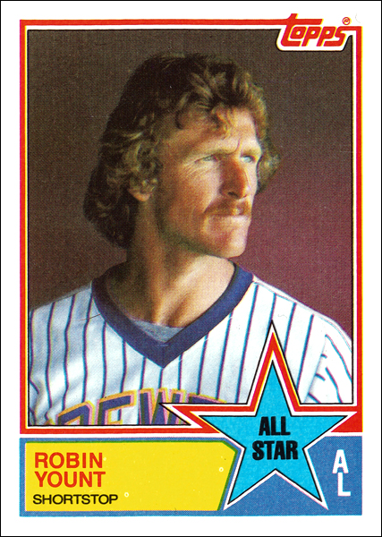

All-Stars
Cards #386-407. Once again All-Stars get special recognition with an additional card. The giant star is fun, and the design fits nicely with the tenor of the set. Unfortunately, the photo choices in this subset are slightly subpar, this great dramatically-lit Robin Yount card (#389) aside. The backs feature a series of write-ups about "Great All-Star Games," which is nice. Always good to get some history into a set.


League Leaders
Cards #701-708. The photos are even worse in this subset. It's as if the effort that Topps made with its base card photos was so onerous that they ran out of steam when it came to the subsets. The Stolen Base Leaders card, featuring Rickey Henderson and Tim Raines (a redundant statement in the 80s), would be a classic if not for the fact that Rickey's photo is as blurry as Liz Taylor in a White Diamonds commercial. And it looks like we're supposed to be examining Dan Quisenberry for lice on the Leading Firemen card. About the only well-balanced and aesthetically-pleasing card is the one featuring ERA Leaders Rick Sutcliffe and Steve Rogers (#707). (At least the Dodgers got Jack Fimple in the deal that exiled the Red Baron to Cleveland...) The card design here is again solid, sticking with the tight and uncluttered look.


Team Leaders
For the second year in a row we get Team Leaders for team checklist cards. These stick closely to the design for the League Leaders, with a team logo taking center stage in place of the AL/NL designations on their counterparts. The photo choices seem generally to be a bit better, but there's still an unusual sloppiness in terms of cropping the two photos on some of these cards to create symmetry and balance. Not so, fortunately, with the Dodgers Leaders card (#681), although we do get a bit uncomfortably close to Pedro and Fernando.


Super Veterans
Finally, here's another big reason that this set strikes a chord with me. Instead of fetishizing what might be with Future Stars cards, this set celebrates that which had been accomplished by some of the game's greats as their fantastic careers reached their latter half. There are 35 players to receive Super Veteran recognition, ranging from 22-year veteran Carl Yastrzemski to seven-year big-leaguer Bruce Sutter. The cards show a black-and-white photo which (supposedly) was taken in the player's debut season, next to a color photo representing the current year. In some cases, the photos and cropping make for wonderfully balanced cards. In other cases, not so much. But the concept is so good that each is a treasure. You get to see some players, such as a clean-shaven rookie Rollie Fingers, undergo massive transformations. The Don Sutton card, featuring his giant rookie ears and his gray veteran afro is a hoot. Other players, such as Kent Tekulve, seem not to have aged at all. The card backs display milestone dates, the year the player debuted and his big-league service time, some season-best totals and career ranking in a few statistical categories, and career highlights that mention awards won. It's a shame that Topps hasn't seen fit to reprise this idea. Something around the turn of the century, featuring some of the younger players to be found in this set (Gwynn, Ripken, Raines, Henderson, Boggs, etc.) would have been great.


So, to go along with what could possibly be the best card design of my collecting lifetime, Topps assembled a set in 1983 that comes pretty close to perfection. I could quibble (and have) about the choice of Record Breakers over highlights, and the repeated exclusion of post-season recaps. But the inclusion of managers and the fabulous Super Vets more than makes up for any deficiencies. Front runner, no doubt.

Sunday, May 19, 2013

1983 Topps: Part II

THE CARDS

First Impressions

This was the second straight year that I opted to send away for the complete set, rather than engage in the fun of discovering the set a pack at a time. It would prove to be the last time I would do so in the 80s. Once again, Topps blew my young mind with something new and different. There had always been a blend of posed and action shots in the sets that I'd collected. This set gave you both on each card (or nearly each). So you got some baseball action, always welcomed, but you also got to see what the guy looked like. And the action shots seemed... more active, somehow. So much so that I asked by comic book fan/artist friend, Greg, to draw a few of the players depicted for me as a way to confirm my impression of their superhero status.


30 Years Later...

I have a confession to make. I think this is the set that will come out on top when all is said and done. I've said that I'm trying to come at this without preconceived notions. But, of course, that's just rhetoric and wishful thinking since today isn't the first day of my existence. I'm going to look at this with an open mind, but I know already that there's a lot that I like about 1983 Topps.


This has to be the tightest design Topps produced in the decade. There are no messy fake autographs. The type is small, compact and professional, without being boring. The Topps logo is a much more reasonable size than in the previous year's set, and incorporated slickly into the photo's border in just the right place. The white border around the card is the perfect size. The space between the color frames and the photos is tight. The colors are again vibrant, but the color schemes take on a slightly more mature shift. (For the first time since 1978, there's not a drop of pink on the Dodgers' cards!) I don't know how much of this anniversary stuff was intentional on the part of Topps over the years, but the 1963 cards were by far the most similar in design to this set, making for a nice twentieth-anniversary nod.


The photography in this set is by far the best that Topps had come up with to date. The focus is sharp, the contrast is higher, and the colors are clean and natural. You get game action on more than 90% of the base cards, with a large number of photos cropped to show the player's entire body. These excellent long-distance shots are made ideal by the inclusion of the player portraits, of just the right size, in the circle formed where the primary photo's border meets the player info border at the bottom. Those portraits are done in the classic Topps style of years past, with a mixture of bats on shoulder, gazing into the distance, etc., with spring training field or big-league stadium backdrops. Frankly, I think this set might be the one I'd pick to represent the history of baseball cards in a time capsule.


The backs are also the best looking of those examined so far. The two-toned salmon color, with the type in a solid, deep black makes for the most legible backs of the bunch. The batter silhouette framing the card number and Topps logo and the pitcher graphic used in the 1982 Highlights section are classy, and a nice anniversary nod to the similar graphics used on the fronts of their 1973 cards. The only quibble I have here is that the 1982 Highlights (when there's room to include them) tend to be boring and monotonous, and therefore easy to ignore. But, honestly, that's the only flaw that I can find with this set's base card design, and it's a minor one.


It's simply a beautifully designed and executed set of baseball cards. To quote Al Michaels, out of context, "You're looking at one for the ages here," folks!

Thursday, May 16, 2013

1983 Topps: Part I

CONTEXT

The 1983 Dodgers benefited from my veteran leadership. I wasn't the hitter that I had once been, but I could still pick it at shortstop. And I had learned a thing or two during my career that I could pass along to the kids on the roster. Actually, we were all kids. I was thirteen years old and in my fifth and final year at Mira Costa Little League in neighboring Manhattan Beach.

Those five years would turn out to be the entirety of my "career" as a ballplayer. The growth spurt that had made me almost athletic at the age of thirteen would prove to be a aberration. By the time I made it to high school I had returned to my accustomed roundish shape, and it was clear that I was better off writing about baseball than playing it. So I settled for becoming the sports editor of my high school newspaper.

I will always look back at my little league days, though, as something like a big-league career. After all, it's as close as I got. And I packed an eventful career arc into those five years. Indulge me while I relive them in a short recap:

1979 Red Sox. Tee Ball. I was a bench-warmer/"rover" (that's the bonus player who floats around at no discernible position because, well, someone paid for him to play so he's got to play). I don't remember much about this season because I barely wanted to be there. I wasn't even a baseball fan yet. My Grandparents, bless 'em, just somehow knew it was where I belonged. (Especially after that year at Ms. Billie's Tap Dancing Studio that we will not be talking about.)

1980 Dodgers. Not as exciting as it sounds. I still didn't really care. I was a few months away from the real Dodgers catching my eye and changing my world. The mental picture I get from this season is of sitting in the dugout having non-baseball conversations with a tomboy with big round glasses who was our team's co-bench-warmer.

1981 White Sox. Things start to get interesting, mainly because now I'm interested. Still not very good, though, so I don't land a starting gig. But when our third baseman gets hit in the face with a ball and the coach asks who wants to replace him, I make my move. I cleanly field my first two chances, throwing the runner out each time, which in this league was like channeling Brooks Robinson. So I Wally Pipped the kid and took his job. The coach came to realize that I knew what I was doing and I also became our primary third base coach, a fact that was mentioned in the big article in the community weekly newspaper when it reported our league championship.

1982 Phillies. This is the year I became a star. I played mostly first base and batted cleanup. At one time I knew my final batting average, but now I only remember that it topped .700. I never did hit a home run over the fence though. My biggest hit was a walk-off triple, which felt pretty damned good. I also vividly remember making a cool play at first base on an errant throw, coming off the base to make the catch and tagging the runner going by while in mid-air. Good times.

1983 Dodgers. This was the real deal, mainly because our kindly old coach had decided that it would be his last year and he bought us all custom big-league replica jerseys with our names on the back. It was so sweet! Getting into uniform for a game was like a religious experience. I played shortstop, and I played it well. (Although I did have a game where I dropped back-to-back grounders and I wanted to dig a hole in the field to hide in.) Unfortunately, I couldn't hit the ball to save my life. It wasn't until the end of the season and a trip to the optometrist that I learned what the problem was. The glasses came too late to help, but I'll always look back at that season as the most fun I'd had on a diamond. After all, I got to wear real Dodger Blue!


That's why when I think of the 1983 Topps set, this Mark Belanger card (#273) is the first thing that comes to mind. Like Belanger, I was a "veteran" slick-fielding, no-bat shortstop who wore #8 for the Dodgers, and whose career had come to an end. When I first laid eyes on this card, when the complete set arrived in the mail, I was still young enough to imagine that I could have a card like that of myself someday. And how cool is that?

Tuesday, May 14, 2013

1982 Topps: Part IV

RANKING

Favorites

Oddball(s) of the Set
Topps seemed to use some kind of green filter on many of the backgrounds of the photos in this set, sometimes with the result that the player looks like they're on some Star Trek world where dancing green women kill the guys in the red shirts. Here are a couple of the more egregious examples. From the base set we have future Cubs manager (poor guy) Jim Essian (#269), who not only gets the martian treatment for his background, but also appears to have been clumsily cut out in silhouette, probably from an even more exiting photo with multiple players standing around doing nothing. Then, from the Traded set, we have Mick Kelleher (#53T), who gets a lousy haircut from the silhouette man at Topps, and appears to be on a planet that patterned its architecture after that of France (the way Star Trek taught us that all alien races emulated specific Earth features). Fittingly, neither player looks too happy with what Topps has done to them.


Most Aesthetically Pleasing/Favorite Non-Dodgers Card(s)
This may be a bit of a cop out, but if I were to try to name a non-Dodger favorite, it would be an arbitrary choice. I don't have an emotional attachment to any specific card. My favorites in this set are all based on how they look, so I'm just gonna show a few of the best. I'll start with a Giant (so definitely more appreciation of aesthetics than favoritism). One of the things that I've learned so far from this project is that I love the use of green in the design elements of a card. It's actually somewhat rare, probably because it's no team's color and because card makers figure you already get enough green from the grass in the pictures. But it's exactly that synchronicity with the grass of the field that strikes a chord for me. I'd never thought of it before, and it isn't obvious given all of the other colors associated with uniforms and logos, but green really is the universal color of baseball, the one color that ties every team together. Now, pair that with the orange of the Giants uniforms, put criminally underrated third baseman Darrell Evans in a classic take-a-knee baseball pose, and you have one hell of great looking card (#17).


Next up we have one of those newfangled Team Leader cards, which didn't particularly grab my attention at the time. But after taking a new look at this Phillies leaders card (#636) I couldn't help but fall in love. First of all, you've got two Hall-of-Famers... well... you know what I mean. You have perfectly cropped photos, with both players gazing in the same general direction, looking downright heroic. (Remember, this is about looks, not substance.) And you've got that classic Phillies logo, with its curves mirroring the curved stripes up the right-hand corner of the card. It's a piece of cardboard that looks so good you almost want to eat it!


Finally, we have a veteran pitcher who spent his entire career with one team (surprise!). I love these two cards because, unlike most of these pairings in the set, they best echo the spirit of the 1972 set's In Action innovation. For the base card, we get the underwear model showing why his face, unlike that of many ballplayers, was well-suited for advertising. I mean, you want to buy something from this guy, right? He's sure selling something, anyway. Plus Topps gives the Orioles the classy matching color treatment for the stripes. Even Palmer's sunburn matches the color scheme. And I'm actually okay with the fake autograph on this one. Just a classic baseball portrait card (#80). Then you couple it with an In Action card (#81) that displays Palmer's beautiful windup. The guy could have been a terrible pitcher and still been a joy to watch. In this shot you get a great angle of his delivery at the point where he's extended in every direction, with the ball framed in the crook of his leading glove hand. Perfect.


Favorite Dodgers Card(s)
I've mentioned that the Fernando Season Highlights card is probably my favorite. But as a sendoff to one of the original Dodger heroes (of my fandom, that is), the three cards that Davey Lopes got in the base set are hard to top (and almost make up for that green-uniformed monstrosity in the Traded set). You get the heroic portrait pose on the base card (#740), which features his final career statistics as a Dodger on the back, and mentions his place as the second leading base stealer in LA Dodgers history, behind only Maury Wills. A great posed batting shot graces his All-Star card (#338). As I've mentioned, I love the design of these cards, and this is a fabulous one. Finally, we get to see him in his stance at the plate on his In Action card (#741).


One Final Thought
There would have been little question about my favorite card in the set had Topps not dropped the ball. Why, Topps? Why did you choose to forego including post-season cards in a set recapping a championship year for my Dodgers? Why did you force me to have to make one of my own, with no back, and no actual corporeal presence other than this trick of light on my computer screen? Not cool, Topps. Not cool.


The Big Picture

Okay, I'm starting to see that this ranking thing is nowhere as easy as I'd expected it to be. Fortunately, the fun comes from the process of taking a closer look at the cards, not from the final ranking. Still, the ranking is the nominal purpose of this exercise so I've got to take it seriously (at least as seriously as you can take "playing" with baseball cards, as my Grandma would always say, to my great consternation).

Like first two sets reviewed, this one has a lot going for it. It was a step forward in a few respects. There was the expansion of the set to 792 cards. There was the replacement of fairly disposable team photos with Team Leader cards. There was the clean, sleek, "modern" design. But they went back to fake autographs. There were some odd color issues, particularly in the Traded set. They also emphasized awkward candid shots, which showed neither action nor professionally posed goodness. And, worst of all, there's no card celebrating the World Champions. On the whole, I like this set a good deal. Just not as much as I like the previous two.

With three sets reviewed, '82 ranks as the #3 Topps set of my collecting lifetime, behind '81 and '80.