THE CARDS
First Impressions
To my 12-year-old self, there was something sleek and modern about these cards. But it was hard to separate my feelings about how the cards looked from the impression left by receiving them in an entirely new way, all at once in the mail rather than sporadically through packs. Once again, the cards got brighter than the previous year. It seemed like something new and different at the time but, then again, pretty much everything was still new and different.
31 Years Later...
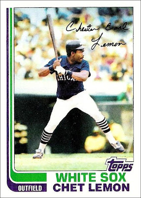
I've come to learn that if something seems particularly "modern" in its day, it's pretty likely to come to feel more dated with the passage of time. When you're a kid, the concept of something "timeless" is just not on the radar. Who cares about context? It's all about now. We want new, different, and exciting. Well, 1982 Topps is one of those sets that sparkled in its day, but remains stuck there with the passage of time. The "sleek" parallel lines wrapping from the upper left corner of the cards to the bottom, where the players' positions are designated, are a very early-to-mid 1980s graphic design staple. Even though the uniforms didn't debut on cardboard until the Traded set came out, I've come to associate this design with the incredibly dated White Sox uniforms of the era. I loved those uniforms at the time. But, like these cards, they're now an exercise in nostalgia.
That is not necessarily a bad thing. In fact, I think it's ideal to have a set come along at least once a decade that eschews the concept of issuing something timeless in favor of giving us something that strongly reflects the moment it represents. The set that best fits that description, I think, is the 1972 Topps set, with its bright colors (novel at the time) and bold, pseudo-psychedelic design. It's fitting that the tenth anniversary of that set should represent something similar within its own quirky decade. I don't know if Topps had that in mind, but they did acknowledge the anniversary in a way with its inclusion of "In Action" cards for various stars, as had been the case in '72.
I have seen many references to this as the "hockey stick" set, but since I'm pretty much a one-sport guy, with hockey taking up zero space in my consciousness, I never made that connection. It's just all about parallel lines. Think Tron, or Activision, or the 1984 Olympics logo, etc. It was just the way things were at the time. The only thing that ties this set's design into a more timeless Topps motif is the use of color, which remains consistent with the past several years (more Dodger Pink!). If they really wanted to lock this set into its time period, Topps would have discarded everything but the boldest of primary colors, like we would see on the cover of the Synchronicity album by the Police in 1983. (Which, incidentally, inspired me, to the horror of my Grandparents, to paint my bedroom bright Red, Blue and Yellow.)
Actually, it's not so much the color, but the white space on the cards that give them that extra bright glow. With particularly wide borders, the lines down the left of the card and the space at the bottom for the player and team names, there is more white surrounding the pictures in this set than perhaps any that Topps had produced to date. The player and team names are given the extra-bold, blocky-type treatment, adding to the 80s motif. This set also marks the debut of the all-lower-case italicized Topps logo that has survived to this day. We get it super-sized here, reflecting the company's desire to distance itself from the upstart Fleer and Donruss. The logo is definitely too big, but in the context of this design it's forgivable. And they incorporate the logo in my favorite manner, as a part of the picture frame, though it would probably have served the design better if it were in the upper right corner.
The photos are similar to those of the 1981 set, with a slight dip in content quality from that of the last handful of sets through 1980. It appears that they wanted to get a more spontaneous feel by using more candids and less posed shots. But the result is more awkward body language and facial expressions. There is, perhaps, a higher percentage of action shots than there were in the previous couple of sets. But Topps doesn't help matters by once again slapping on the fake autographs. In fact, that's probably the single biggest distraction from the sleek and modern concept that they seemed to be shooting for. A strange decision, given the set's design.
The backs have a slight touch of the modern, as well, with its curved borders enclosing two-toned cartoon and stat boxes. The cartoon and accompanying secondary info blurb do not pertain to the player on the card, but all seem to be related to active players, coaches or managers. I guess that's interesting, though I still prefer that the information on a card be about that player. Variety is nice, though. As with 1981, the cartoon section goes away for players with particularly long stat lines. I like the use of green here. The two shades make for a pleasantly readable back, probably my favorite so far, just ahead of 1980.
Overall, it's a basic, utilitarian, time-locked, bright, reasonably solid design. It's not exciting, but it doesn't offer a lot to complain about, either.


No comments:
Post a Comment